
a.k.a. Christian Bjørndalen

Release Mobile visual identity
Release was a Norwegian startup focusing on sustainability through prolonging the life of electronic devices. The idea was to recycle all useable parts, securely removing data from and grading second hand devices for redistribution. They needed an upgrade og their existing logo and a refreshing new colour scheme to go with a new design program.
I was lead designer on the complete visual identity work; brushing up the old logo, finding new fonts and colours and nailing the creative design concept. Working in a skilled mixed media team we truly gave life to something bright and shiny for this promising client – who unfortunately crashed more or less at launch due to abruptly limited access to second hand gadgets (much attributed the post pandemic market), thus creating a supply chain unable to comply with immediate demand.
Photoshop / Illustrator / Brandpad

Special Deals
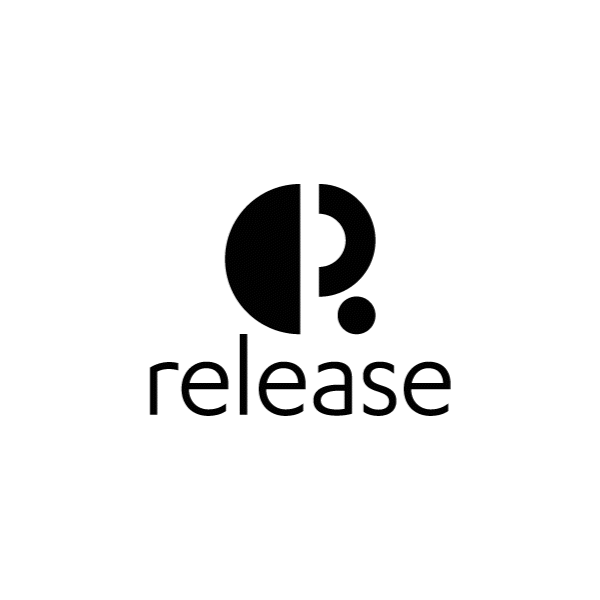
The pre existing design profile didn't quite cut it in the "bright and catchy" department, but had elements (the R symbol) that the client really wanted to remain recognisable from early market communication.
I figured the colours cold lose the moss-and-soil feel and rather focus on the colourful extremities for a more eye catching effect. The slightly revamped logo symbol also needed a tighter font with distinct power/elegance balance in its variety.
"If it can’t be reduced, reused, repaired, rebuilt, refurbished, refinished, resold, recycled, or composted, then it should be restricted, designed or removed from production."
Pete Seeger
The symbol got tighter and more defined
Karbon from Klim Type Foundry is a great and diverse font with nice weight variations for both power and subtlety.


The colours should be able to "pop" and stand out, but I also needed some more subtle darker and lighter variations.


The logo symbol itself is composed of reusable shapes.


